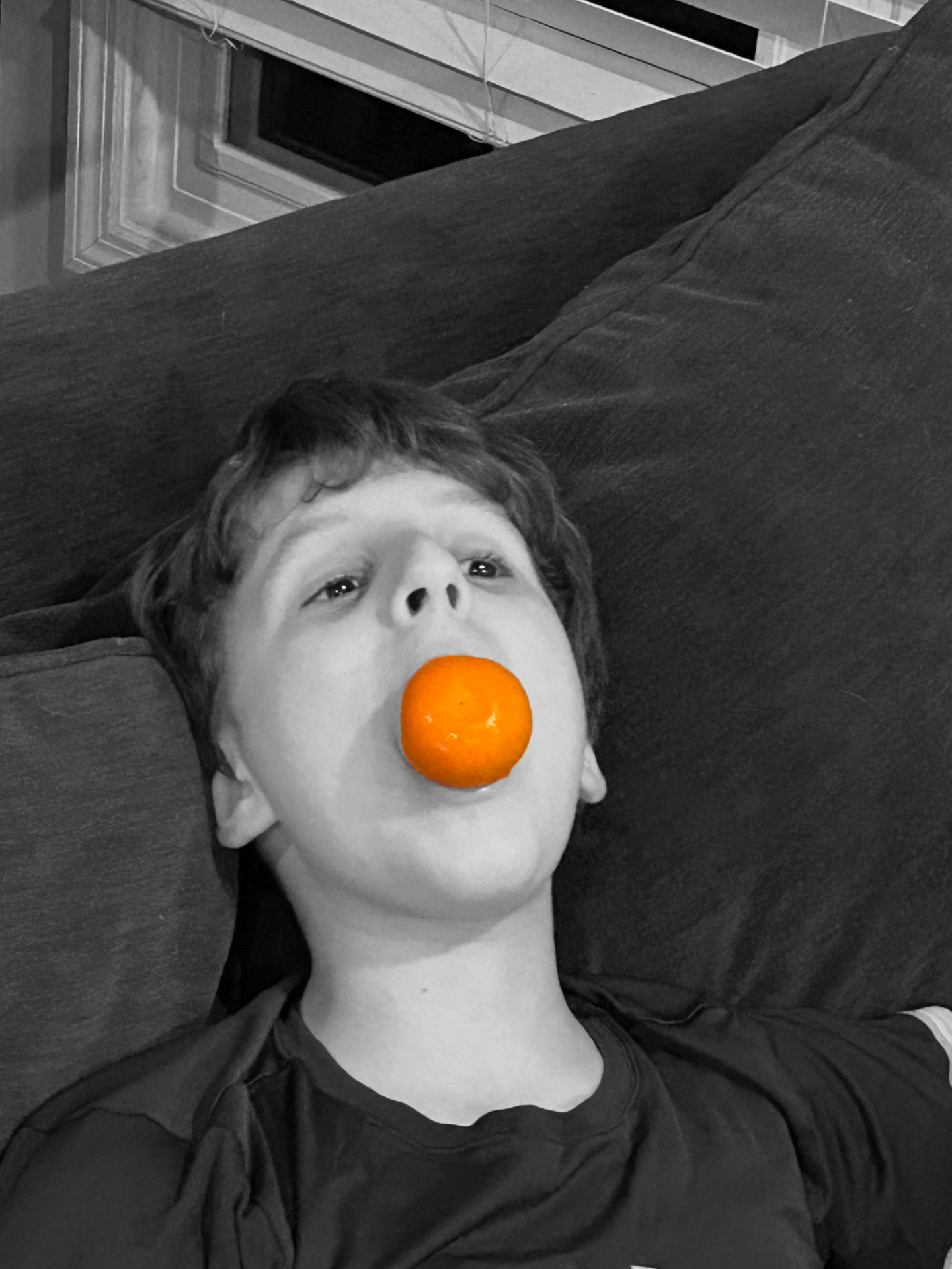
In my house on the couch.
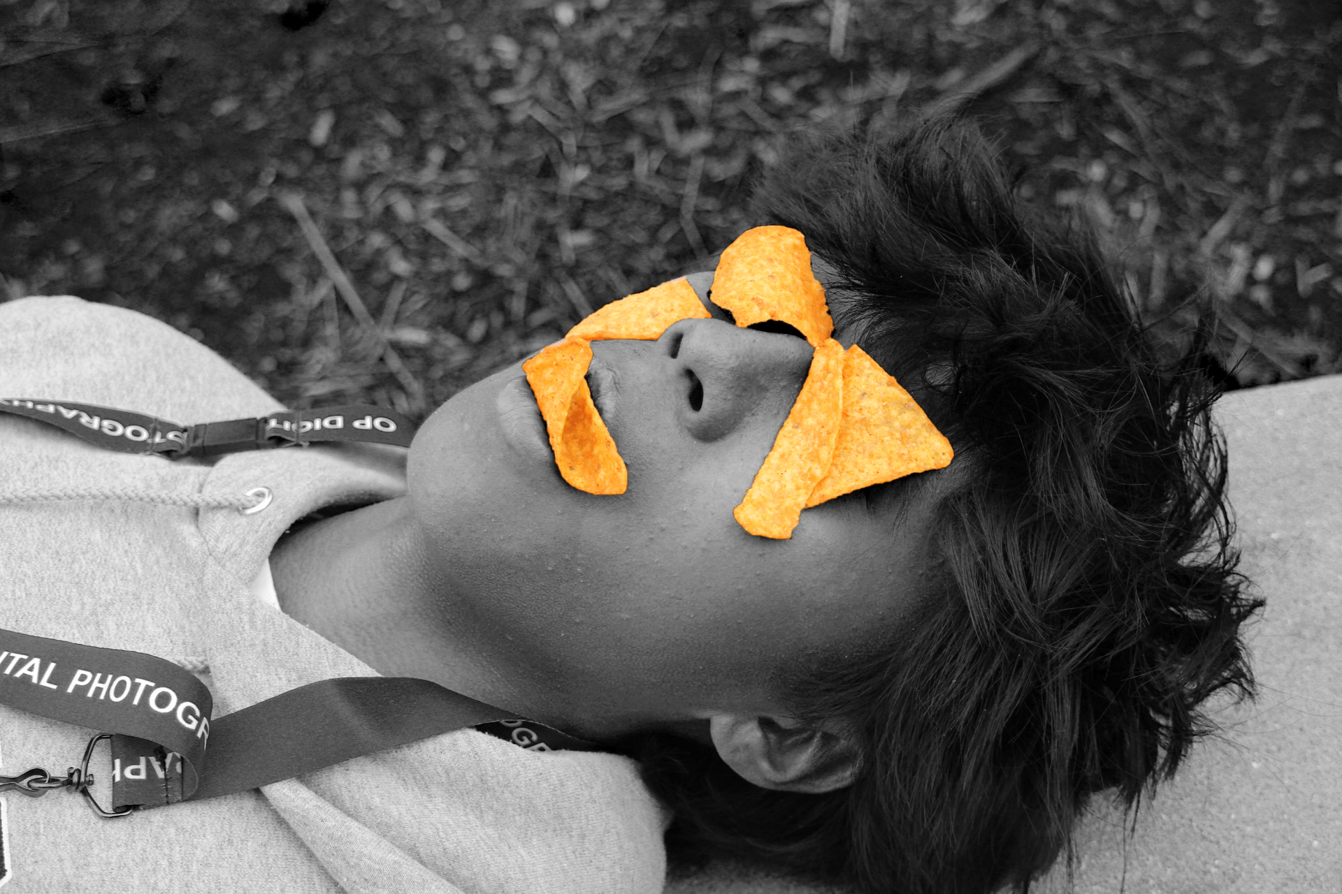
In school outside of the cafeteria on the wall side.
Question one: The reason I chose both of these foods is because they are both orange and orange is the theme of this post. The significance of these foods is showing the bright contrast of orange compared to the other colors of the world. Orange is such a rare and bright color. It’s good to see it in nature as an orange and as a food as a dorito.
Question two: The light source of the second photo is the sun in the middle of the day. It makes the food actually pop a lot more because I lowered the lighting of the rest of the photo. For the first photo, the lighting was from the lighting of my house it was nighttime. I think that this caused the photo to be a bit less vibrant in the color of the orange. It seems like the second photo looks more happy and goofy with the lighting and the first photo looks a bit more surreal.
Question three: I choose black and white so I can affect the brightness of the colors around my vibrant food. I did this because I could lower the brightness so the food stands out so much you are immediately attracted to it. Also, it helped take out some things in the background that could take away from the photo.
Question four: The color and the color splash contribute to my image by just making the food pop a lot. I masked the specific areas of the photo because they were easily the most colorful parts of the photo. The rest of the photo for both wasn’t very colorful or interesting.
Question five: I think that the camera at school really enhances my second image. I don’t remember the actual specs of the photo but you can tell by looking at it, it took so much more detail than my first photo. The first photo clearly is a lot worse because of the camera quality of the iPhone compared to the school cameras.
Question six: The advice I would give to next year’s photograph people is to take both photos with the school cameras. They are much better quality than your phone and will make the photos look much better. Secondly, use more unique shapes of foods instead of just circles it makes the photos look much more interesting to look at.